
Recallab › Blog › Biostatistics without fear: six NEET PG chart questions you can answer in a minute
Biostatistics without fear: six NEET PG chart questions you can answer in a minute
Biostatistics questions look like arithmetic. Most are really about reading: which number goes over which, and what the chart can and cannot tell you.
Register to practise NEET PG biostatistics questions →Free account, no card needed.
Candidates often leave these questions for last, and lose marks that take a minute to earn. The charts repeat: an outbreak curve, a trend over years, a skewed distribution, a two-by-two table. Each has one rule that settles most questions built on it. Below are six real Recallab MentorQs, one for each kind of chart. Try each before you open the answer.
Before any chart or table: three questions
- What is being counted? Cases, deaths, people who tested positive: the numerator.
- Out of what? The whole population, only the diseased, only those who ate the dish: the denominator. Most wrong answers use the wrong one.
- What does the question ask for? A rate, a ratio, a pattern or a decision. Read the question before you start calculating.
Outbreaks and trends over time
Recallab example 1 · outbreak histogram
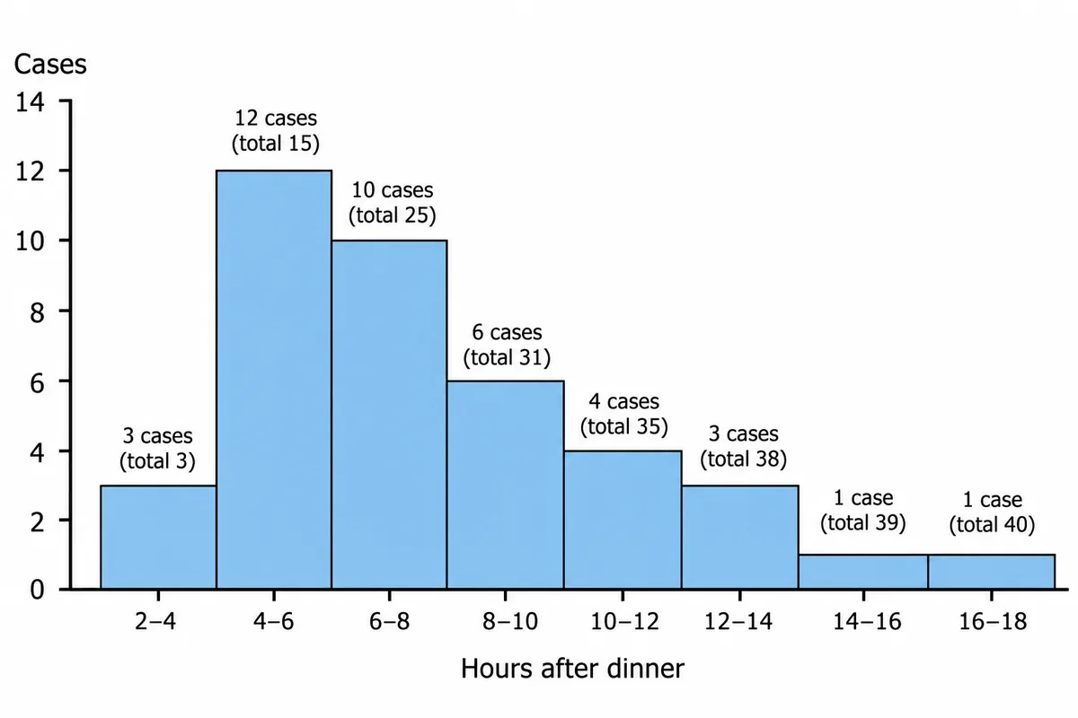
Cases of an outbreak after one canteen dinner are drawn in the figure by the hour of onset, with the running total written above each bar. How is the incubation period of this outbreak best stated?
Look first: add up the bars before reading any single one: how many cases in all, and which bar holds the middle case?
 View larger ↗⤢ Tap to enlarge
- AAbout six to eight hours
- BAbout two to four hours
- CAbout sixteen to eighteen hours
- DAbout four to six hours
Show the answer and explanation
Answer: A. About six to eight hours
Rule: the incubation period of a common-source outbreak is the median, the time to the middle case, because onset times are skewed to the right. There are forty cases, so the median is the twentieth. The running total is 15 at the end of the four-to-six hour bar and 25 at the end of the six-to-eight hour bar, so the twentieth case falls between six and eight hours.
Why the closest rival loses: four to six hours (D) is the tallest bar, which is the mode, and it moves if the bars are drawn differently. Two to four hours (B) is the first case, the minimum; sixteen to eighteen (C) is the last, the maximum.
Recallab question 55633 · Social and Preventive Medicine › Epidemiology · reference: Park's Textbook of Preventive and Social Medicine
Recallab example 2 · time series
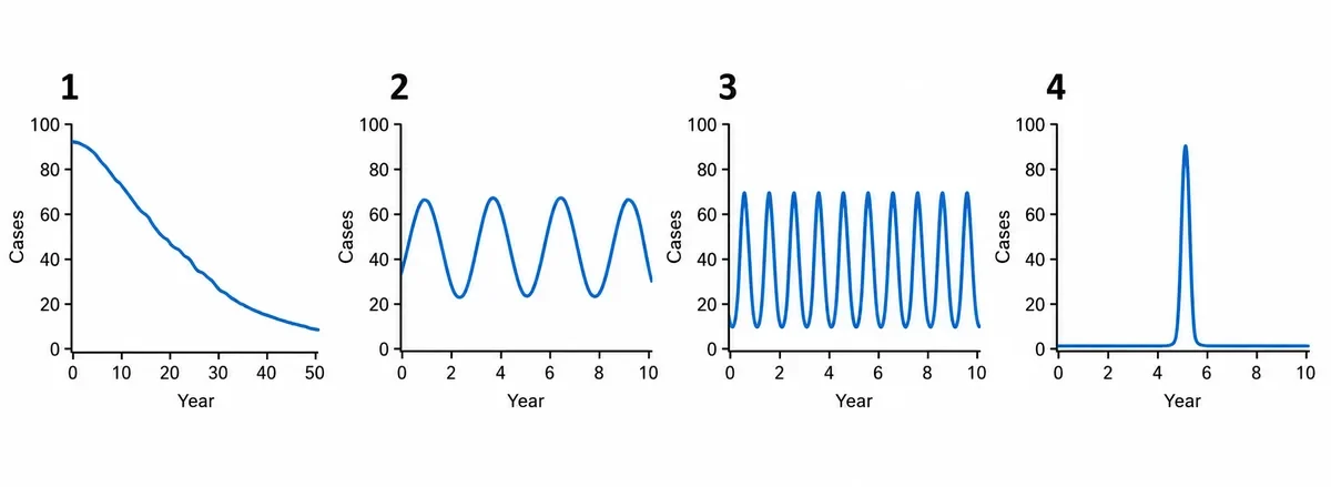
Four graphs of case counts against years are drawn in the figure, numbered. Measles incidence is shown before vaccination was introduced. Which numbered graph shows the pattern?
Look first: measure the gap between peaks on the time axis before you name the pattern.
 View larger ↗⤢ Tap to enlarge
- AGraph 2, a cyclic trend
- BGraph 1, a secular trend
- CGraph 4, a common source epidemic
- DGraph 3, seasonal variation
Show the answer and explanation
Answer: A. Graph 2, a cyclic trend
Rule: read the spacing of the peaks. Graph 2 peaks every two to three years: a cyclic trend. Each measles epidemic uses up the susceptible children, and it takes a few years of births to build the pool back up.
Why the closest rival loses: graph 3 (D) peaks every year, which is seasonal variation. Graph 1 (B) is a slow change over decades, a secular trend; graph 4 (C) is a single spike, a common-source epidemic.
Recallab question 55338 · Social and Preventive Medicine › Epidemiology · reference: Park's Textbook of Preventive and Social Medicine
Describing a distribution
Recallab example 3 · skewed distribution
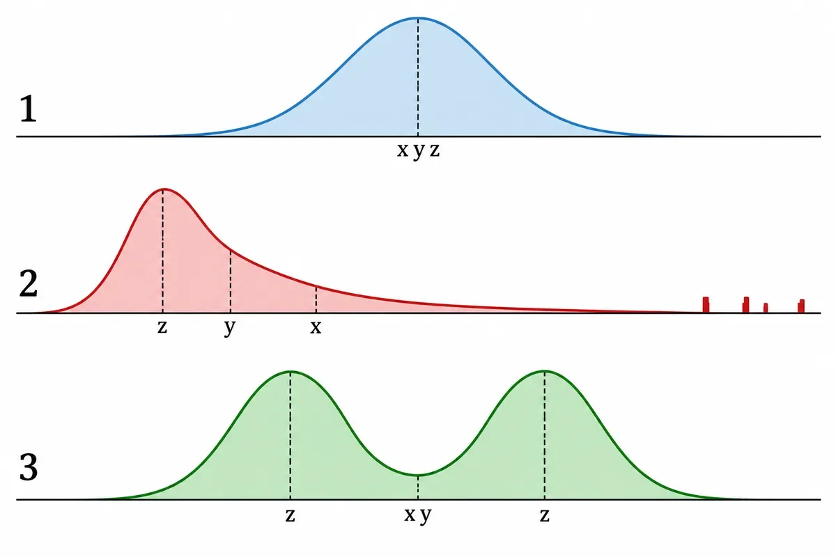
Three distributions of the same measurement are drawn in the figure with the mean, median and mode marked on each. Which summary should be reported for distribution 2?
Look first: find which way the tail runs, then see which marker it has pulled with it.
 View larger ↗⤢ Tap to enlarge
- AMean with range
- BMode alone
- CMean with standard deviation
- DMedian with interquartile range
Show the answer and explanation
Answer: D. Median with interquartile range
Rule: skewed data are summarised by the median and the interquartile range. Distribution 2 has a long tail to the right, and the extreme values drag the mean out along it; the median stays with the bulk of the data. In a symmetrical curve like distribution 1, the three markers coincide and any of them will do.
Why the closest rival loses: mean with standard deviation (C) uses the very marker the tail has pulled out. Mean with range (A) adds a spread set by the same extremes; the mode alone (B) fits the two-peaked distribution 3, not this one.
Recallab question 55030 · Social and Preventive Medicine › Biostatistics · reference: Park's Textbook of Preventive and Social Medicine
Two-by-two tables
Most NEET PG epidemiology arithmetic happens in a two-by-two table. Before you calculate anything, ask how the table was built: by disease, by exposure or by test result. That decides which ratio you are allowed to calculate.
Recallab example 4 · case-control table
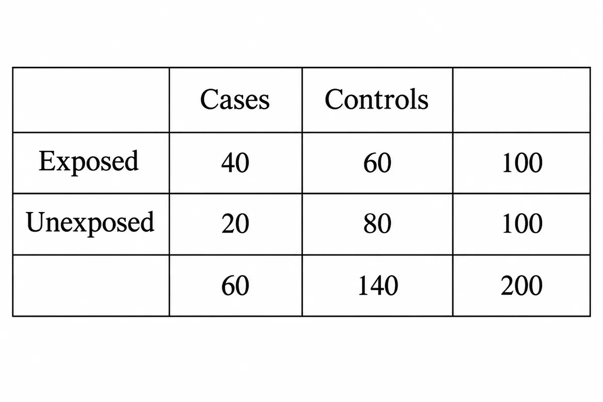
A two-by-two table from a case-control study is drawn in the figure with the four cell counts filled in. What is the measure of association calculated from these cells?
Look first: check how the people were chosen, by disease or by exposure, before you divide anything.
 View larger ↗⤢ Tap to enlarge
- AThe relative risk
- BThe odds ratio
- CThe attributable risk
- DThe exposure rate
Show the answer and explanation
Answer: B. The odds ratio
Rule: a case-control study gives the odds ratio, the cross-product (ad over bc). Here that is 40 × 80 over 60 × 20, which is 2.67. People were chosen because they had the disease or not, so the study cannot measure how often the disease occurs.
Why the closest rival loses: the tempting sum is 40/100 against 20/100, a relative risk (A) of 2. But the row totals of 100 were set by how many cases and controls the investigator chose, not by incidence. The odds ratio approximates the relative risk only when the disease is rare. Attributable risk (C) is a cohort measure too, and an "exposure rate" (D) is not a measure of association.
Recallab question 55836 · Social and Preventive Medicine › Epidemiology · reference: Park's Textbook of Preventive and Social Medicine
Recallab example 5 · screening tables
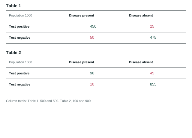
Two two-by-two tables are drawn in the figure for the same screening test used in two different populations, with every cell count filled in and the column totals printed below. Sensitivity and specificity work out identical in both. Table 1 gives the higher positive predictive value. What explains that?
Look first: work out the prevalence in each table first: the people with the disease over the whole population.
 View larger ↗⤢ Tap to enlarge
- AHigher sensitivity
- BHigher specificity
- CLower disease prevalence
- DHigher disease prevalence
Show the answer and explanation
Answer: D. Higher disease prevalence
Rule: predictive values follow prevalence; sensitivity and specificity do not. Both tables give 90% sensitivity (450/500 and 90/100) and 95% specificity (475/500 and 855/900). But prevalence is 50% in table 1 and 10% in table 2. The positive predictive value is 450 of 475 positives (95%) against 90 of 135 (67%). With fewer disease-free people, there are fewer false positives to dilute the true ones.
Why the closest rival loses: lower prevalence (C) has the direction backwards; table 1 is the high-prevalence population. Sensitivity (A) and specificity (B) are identical in both tables, so neither can explain a difference.
Recallab question 56233 · Social and Preventive Medicine › Screening · reference: Park's Textbook of Preventive and Social Medicine
Recallab example 6 · stratified tables
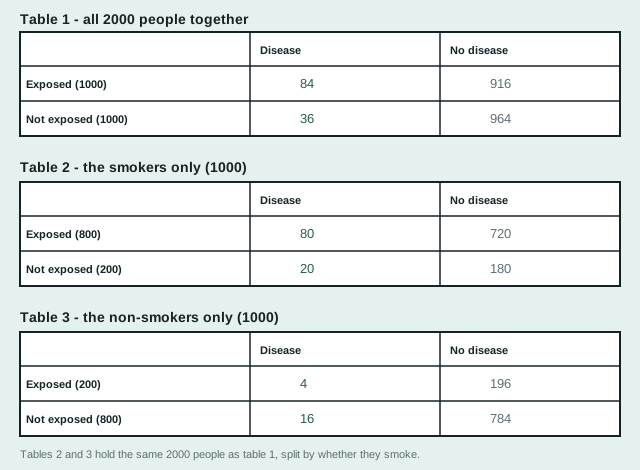
The same two thousand people are tabulated three times in the figure: once all together, then split into two groups by a third factor. What is that third factor doing to the crude result?
Look first: compare the rates inside each smaller table before you trust the big one.
 View larger ↗⤢ Tap to enlarge
- AMediating it on the causal pathway
- BModifying the effect
- CConfounding it
- DProducing it by chance
Show the answer and explanation
Answer: C. Confounding it
Rule: if an association vanishes inside every stratum, the stratifying factor was carrying it: confounding. Crude, the exposed have more than twice the risk (84 against 36 per 1,000). Among smokers it is 10% against 10%, and among non-smokers 2% against 2%. But 800 of the 1,000 exposed smoke, against 200 of the unexposed. The crude table compared mostly smokers with mostly non-smokers.
Why the closest rival loses: effect modification (B) shows the strata differing from each other; here both agree, showing no effect. A mediator (A) is caused by the exposure, on its pathway; here the groups differ in smoking from the start. And 84 against 36 in groups of 1,000 is far beyond chance (D).
Recallab question 56433 · Social and Preventive Medicine › Epidemiology · reference: Park's Textbook of Preventive and Social Medicine
The one-minute routine
| If you see | Ask first | It usually settles |
|---|---|---|
| An outbreak histogram | Where is the middle case? | The incubation period (median) |
| Case counts over years | How far apart are the peaks? | Cyclic, seasonal, secular or a single epidemic |
| A skewed curve | Which way does the tail run? | Median and interquartile range |
| A case-control table | Were people chosen by disease? | Odds ratio, not relative risk |
| Screening tables | What is the prevalence in each? | Why the predictive values differ |
| Stratified tables | Does the effect survive inside each group? | Confounding or effect modification |
For more on reading what a question asks, see NEET PG question types: recognise the task before you choose the answer. For other kinds of figure, from heart-sound traces to slit-lamp views, see ten NEET PG image questions. For the graphs pharmacology asks about, from dose-response curves to steady state, see six NEET PG pharmacology graphs. For the rest of community medicine, see six questions on India's national health programmes.
Why candidates use Recallab
- Built towards 22,000 — a batch at a time
- Illustrations drawn for the question
- Every option explained, not just the right one
- AI study tools that are live today
- Start free, today
Or see the plans, or try a timed mock section.
Register to practise NEET PG biostatistics questionsFree account, no card needed. Practise with every option explained and a reference on every question.Drawn from questions #55633, #55338, #55030, #55836, #56233, #56433 in the Recallab bank, each with its own verified answer and current-edition reference. Last reviewed 24 September 2026.